
Family Beer & Liquor
Brand Strategy • Rebrand • Creative Direction • Web Design • Photography & Video • Advertising
Building a modern, cohesive brand experience across digital and physical touchpoints.
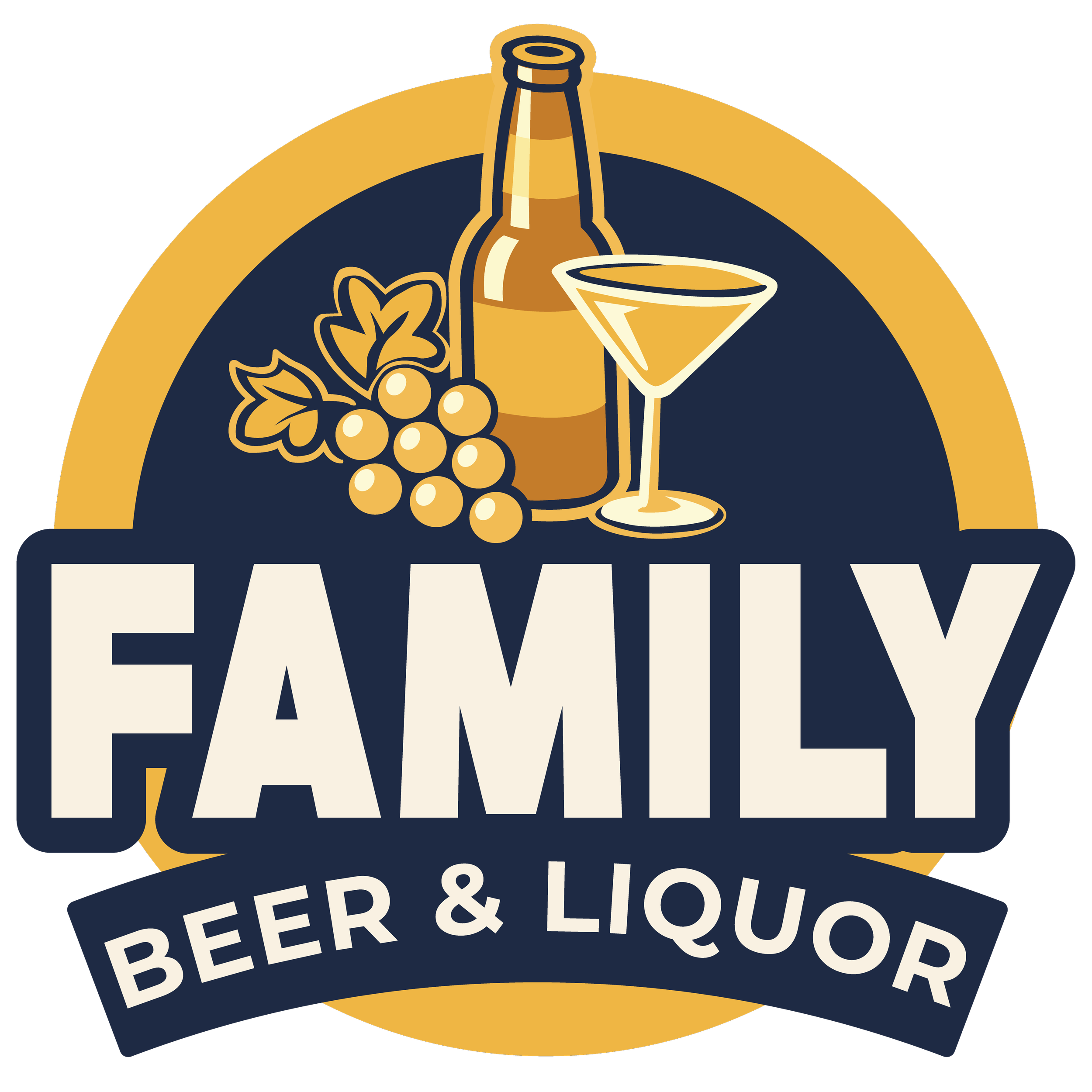
Creating a Brand Built for Growth
Family Beer had an established presence, but its visual identity and customer experience needed a stronger, more consistent foundation for its next stage of growth.
The goal was bigger than redesigning a logo. We wanted to create a recognizable brand system that could live cohesively across the website, social media, advertising, in-store experiences, apparel, photography, video, and future campaigns.
My role spanned brand strategy, creative direction, design, digital experience, content production, and campaign execution—helping take the project from rebrand concept through launch and ongoing marketing.
The Challenge
As Family Beer continued to grow, the brand needed an identity that could translate consistently across an increasing number of customer touchpoints.
The challenge was to create something that felt fresh without losing the personality of the existing business. Just as importantly, the new identity needed to be practical. Internal communications and social teams needed clear guidelines and reusable assets that would allow them to create content while keeping the brand recognizable.
This meant thinking beyond individual creative pieces and building a system that could scale.
The Rebrand
The visual refresh began by rethinking Family Beer’s identity and how it should show up in the market.
I helped redesign the logo and establish the visual direction for the refreshed brand. From there, I developed guidelines around the identity and created a framework that could be applied consistently across both digital and physical experiences.
The objective wasn't simply to make the brand look different. Every decision needed to help make Family Beer more recognizable, cohesive, and easier for the team to carry forward.
Building the Brand System
Once the new identity was established, the next challenge was turning it into a usable brand system.
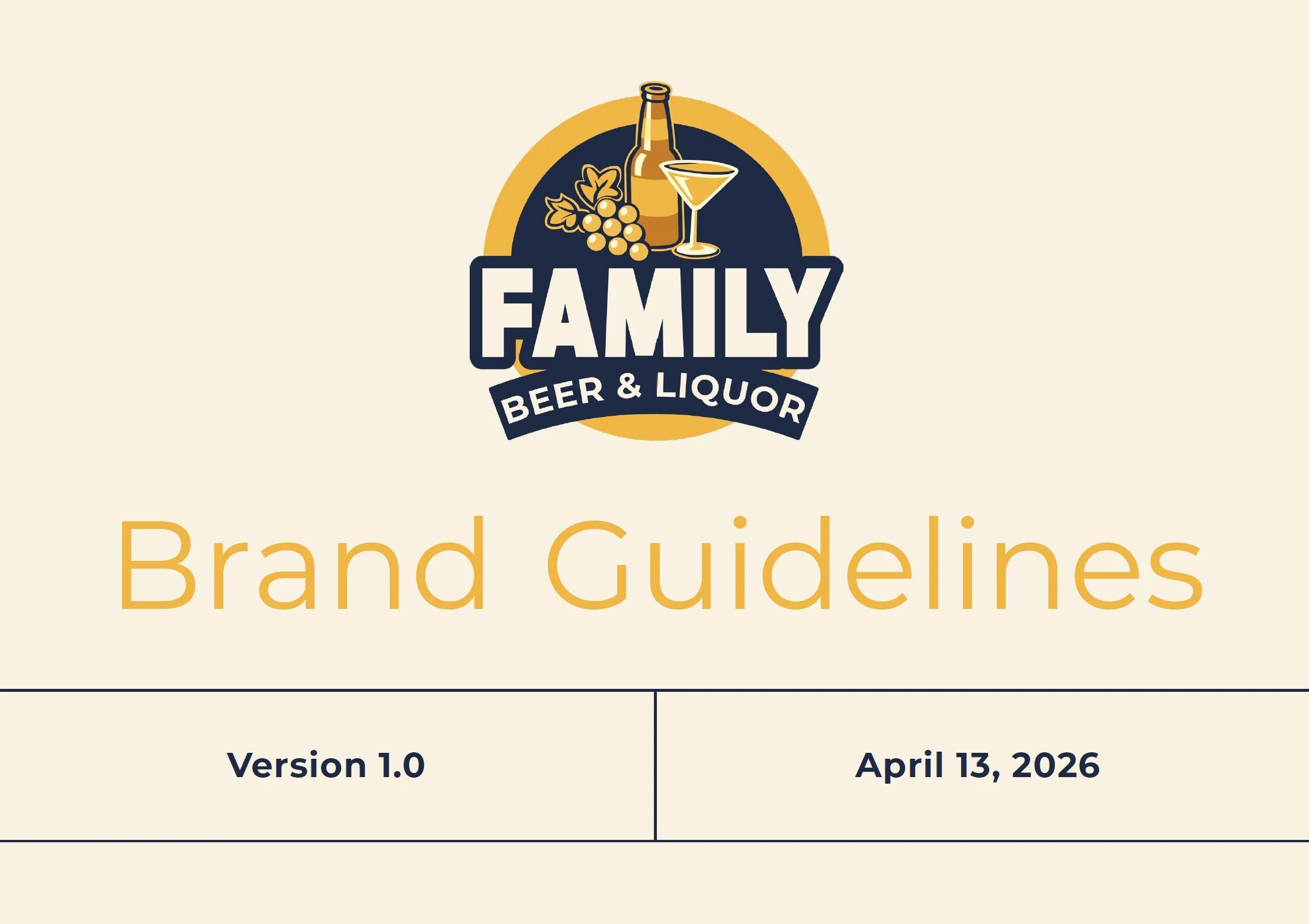
I developed brand guidelines, templates, and creative direction to help communications and social team members maintain consistency without requiring every asset to be designed from scratch.
The system established a common visual language across:
Logo & Identity: A refreshed identity and supporting logo variations designed for use across different formats and environments.
Brand Guidelines: Clear direction for maintaining a consistent visual identity as new materials are created.
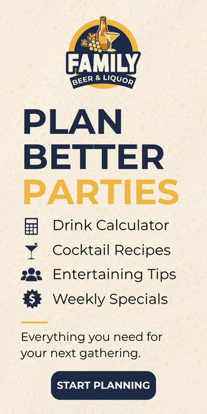
Digital & Social Templates: Reusable creative that allows the team to produce content while staying within the established brand.
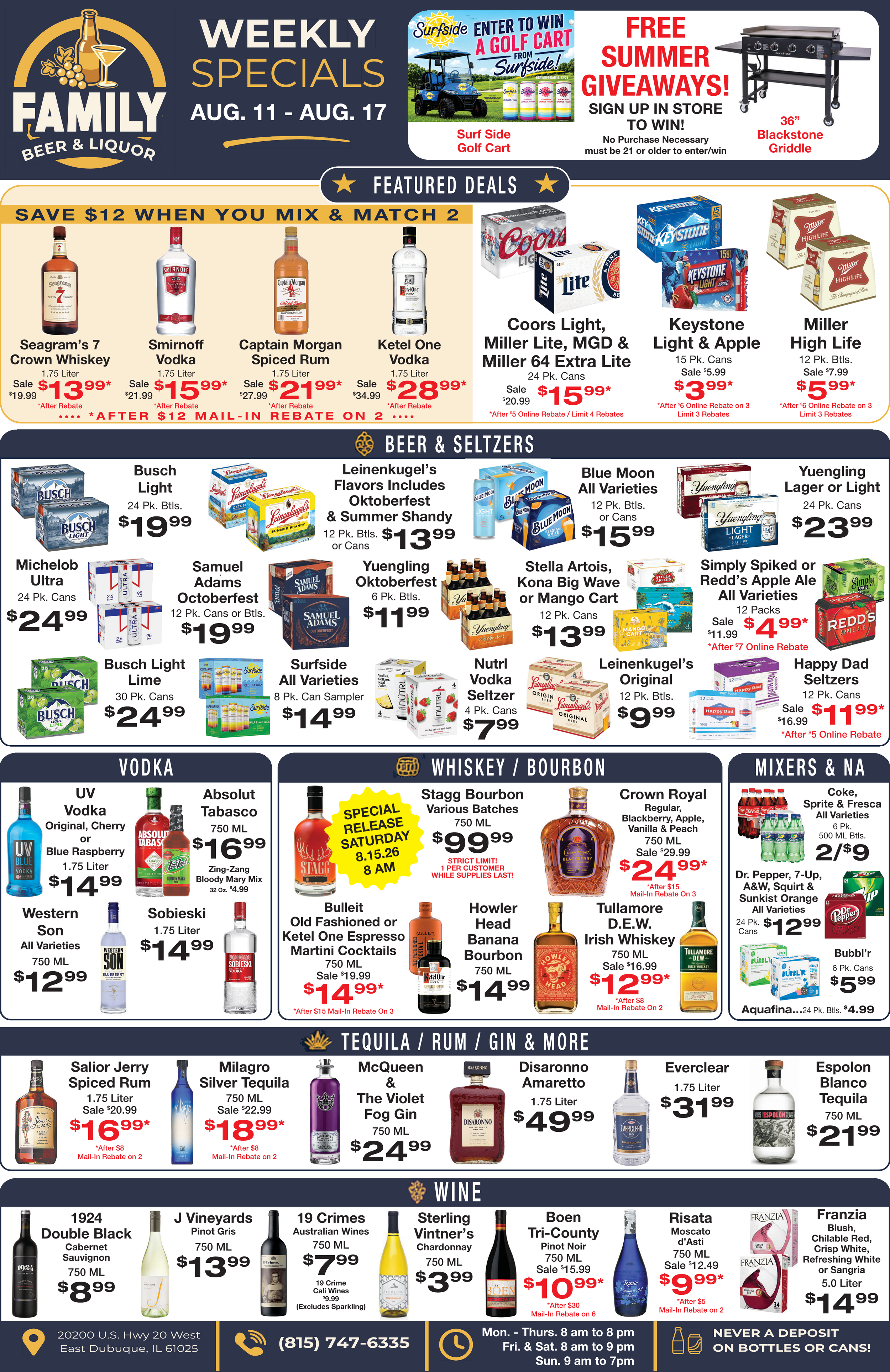
Advertising & Campaign Creative: A visual framework that could adapt to promotions, paid media, giveaways, and future campaigns.
The result was a brand that could evolve without becoming fragmented.
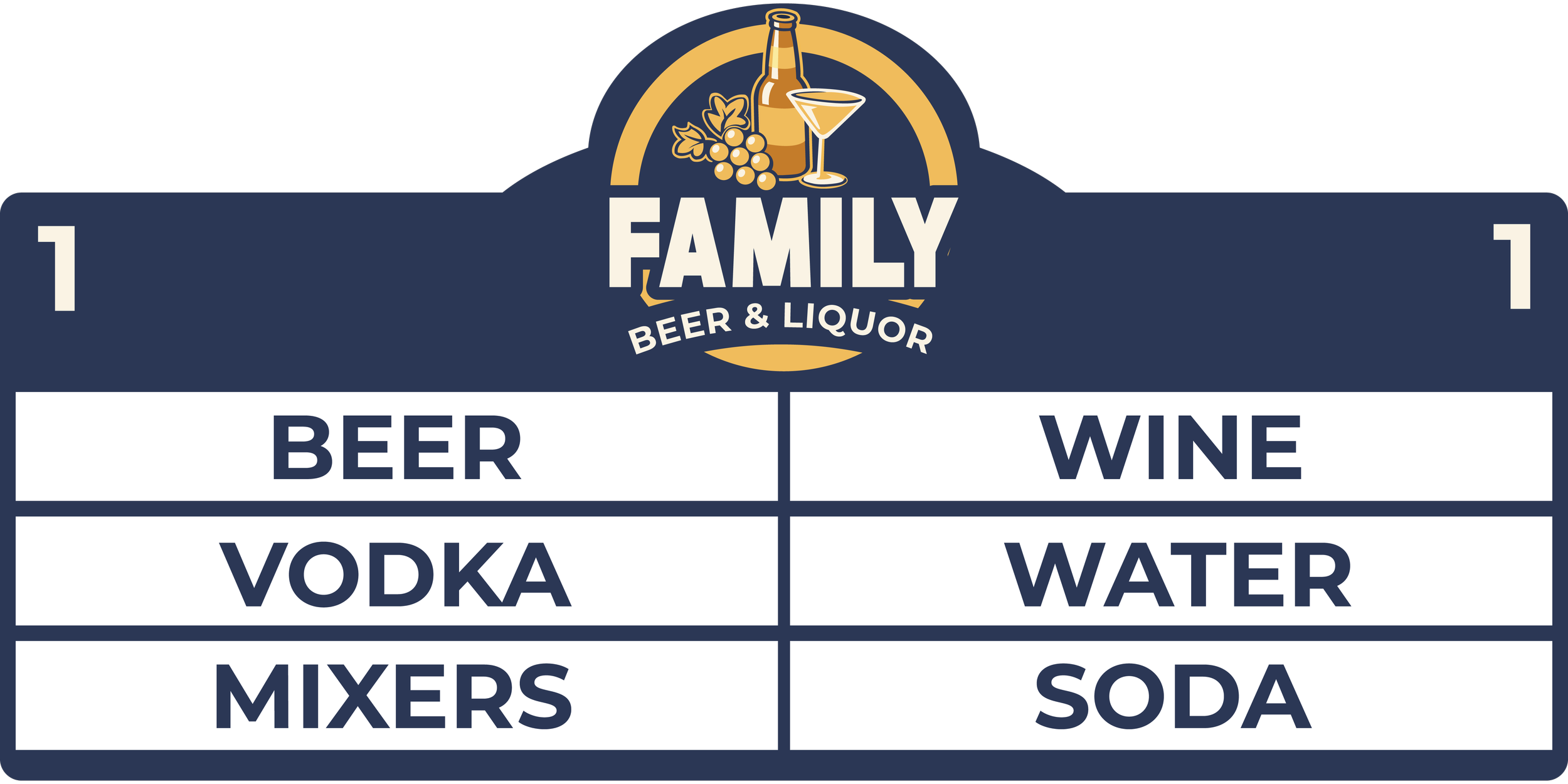
Taking the Brand Into the Real World
One of the most important parts of the project was making sure the identity didn't exist only on a screen.
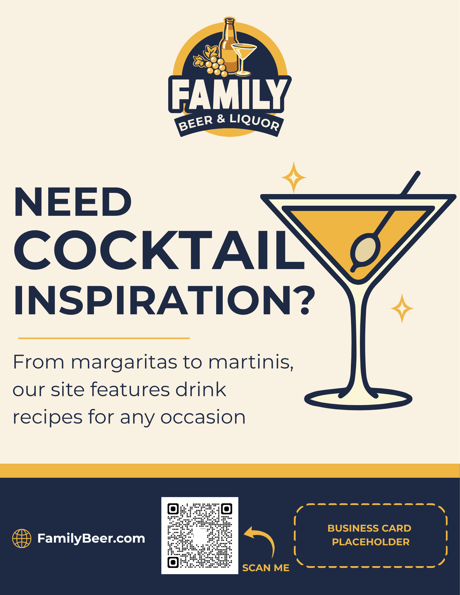
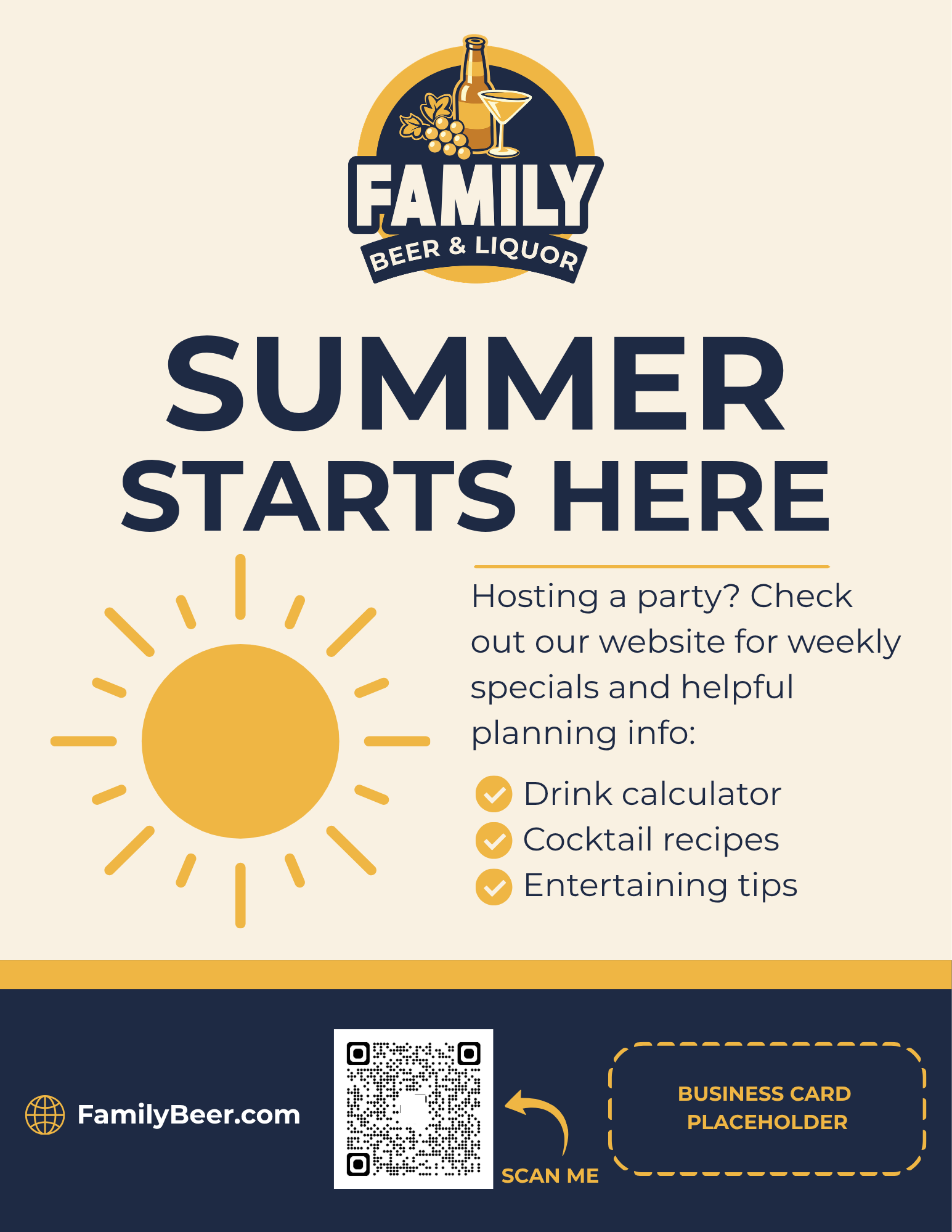
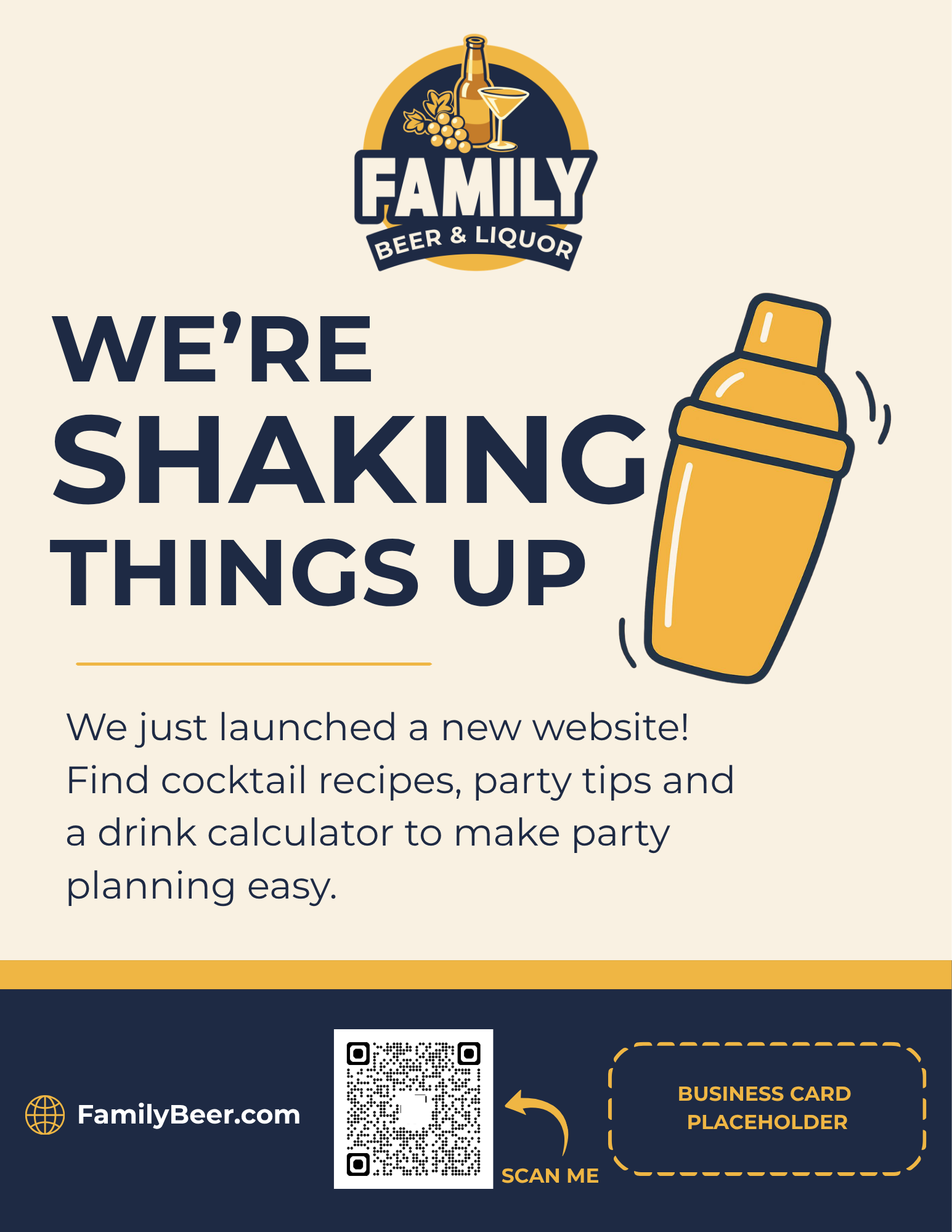
I extended the new visual direction into in-store signage, apparel, promotional materials, and other customer-facing applications. Each touchpoint became another opportunity to reinforce the same recognizable brand.
Creating consistency between digital marketing and the physical experience helped make the rebrand feel like a true evolution of the business rather than simply a new logo.
Redesigning the Digital Experience
The website also needed to reflect the new identity.
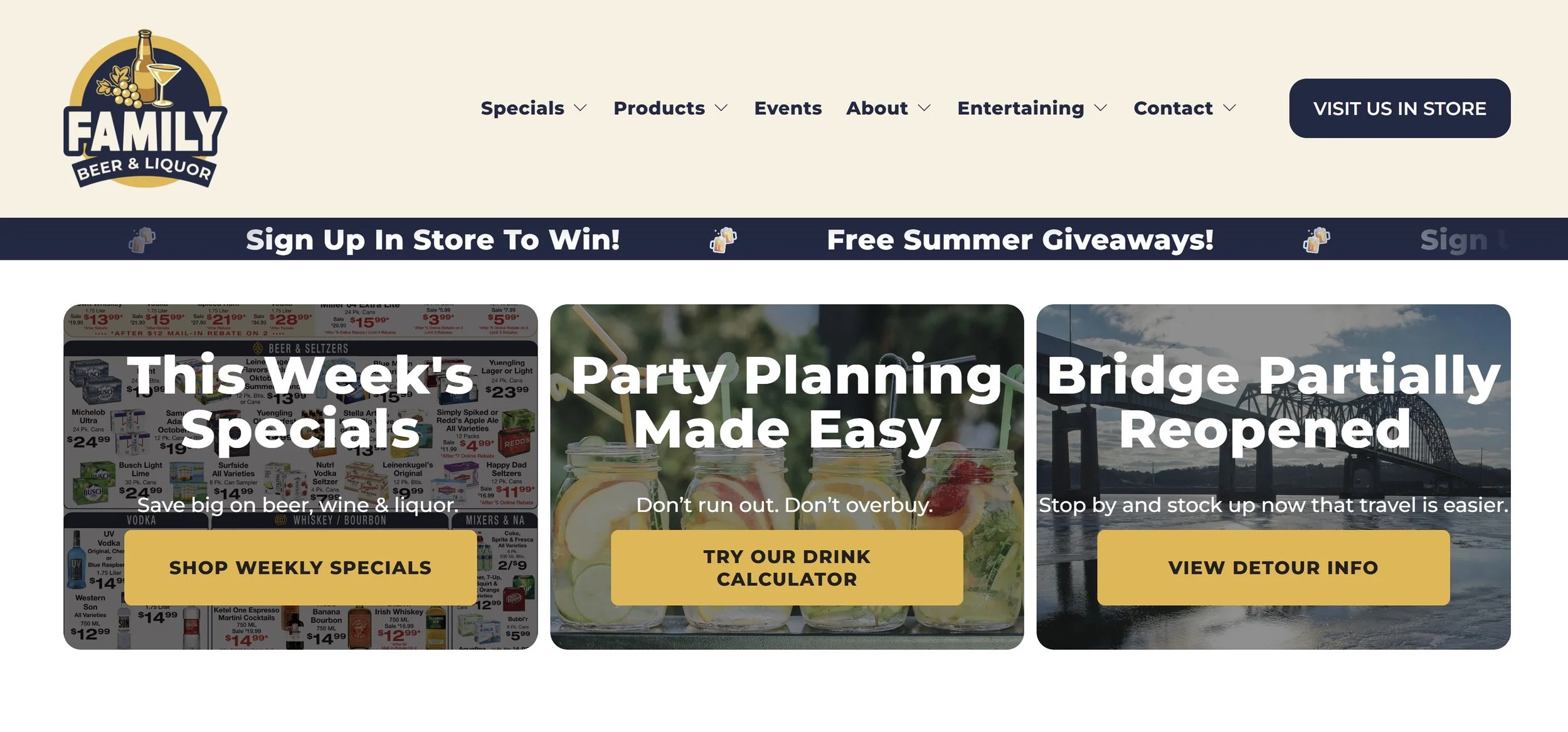
I redesigned Family Beer’s website to bring the refreshed visual direction into the digital customer experience while creating stronger consistency between what customers encountered in search, advertising, social media, and the physical business.
The site became a central expression of the new brand and provided a stronger foundation for ongoing marketing and organic discovery.
From Rebrand to Campaigns
The launch wasn't the end of the project.
Following the rebrand, I continued developing advertising creative and supporting campaigns around promotions and giveaways while reviewing performance and identifying opportunities to strengthen messaging and creative.
That ongoing work allowed the identity to move from a brand system into an active marketing platform—one that could support both awareness and customer acquisition.

The Results
The impact extended beyond the visual transformation.
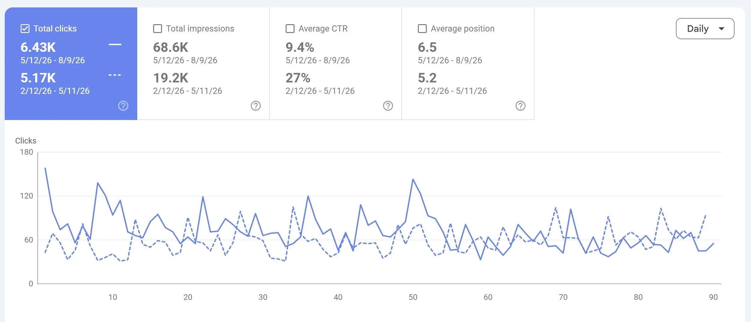
Comparing the 90 days following the launch with the previous 90-day period, Family Beer experienced substantial growth in Google Search visibility and traffic.
+257%
Search Impressions
Google Search impressions increased from 19.2K to 68.6K, meaning the brand appeared in search approximately 3.6× as often following the rebrand.
+24%
Organic Search Clicks
Clicks from Google Search increased from 5.17K to 6.43K, bringing more people from organic search to the Family Beer website.
These results are particularly meaningful because the goal of the project wasn't simply to create a more polished identity. It was to build a brand that could be discovered, recognized, and carried consistently through every part of the customer experience.
More Than a New Logo
Family Beer evolved from a visual rebrand into a connected brand ecosystem.
The identity established the foundation. Brand guidelines and templates made it scalable. The website created a stronger digital experience. Photography and video gave the brand a recognizable visual voice. Signage and apparel carried that identity into the physical world. Advertising and campaigns gave us a way to continue building awareness after launch.
And in the 90 days following the launch, that work coincided with a 257% increase in Google Search impressions and a 24% increase in organic search clicks.
For me, the project demonstrates what successful brand work can accomplish when strategy, design, content, digital experience, and marketing are developed as parts of the same system.